
PLANTEGA
VEGAN BODEGA - NYC
Plantega is a company making plant-based food accessible and affordable to all New Yorkers. They accomplish this by meeting New York where they are; at the bodega, bring plant-based options to both vegans and non-vegans alike.
The Problem
Plantega has a very challenging design situation. They need to fit in with various signage across almost 50 delis in New York City. Their menu runs parallel with non- plant based menus in bodegas, so they need to fit in seamlessly, while at the same time not being too much. Design wise - they can’t appear way too designed, as that would not fit in with existing bodega signage. They need to appear as a premium, interesting offering - but not as a gentrifying nightmare brand thats taking over delis. They wish to work within the existing bodega system, merely brining new options - so a design system that stands out but doesn’t shout was needed.
As you can see on the right - the menus and branding they had were dull, a bit unappealing and had a ton of room for improvement. There was a confusing lack of consistency across menus, social media and other brand assets.

The Solution:
Over the course of 2023 and onward I have worked with Plantega to revamp tired old menus, branding systems, posters, a-frames etc. We worked closely to figure out the taxonomy of what we are communicating as well as how we can elevate but not outclass other brands in the bodegas.
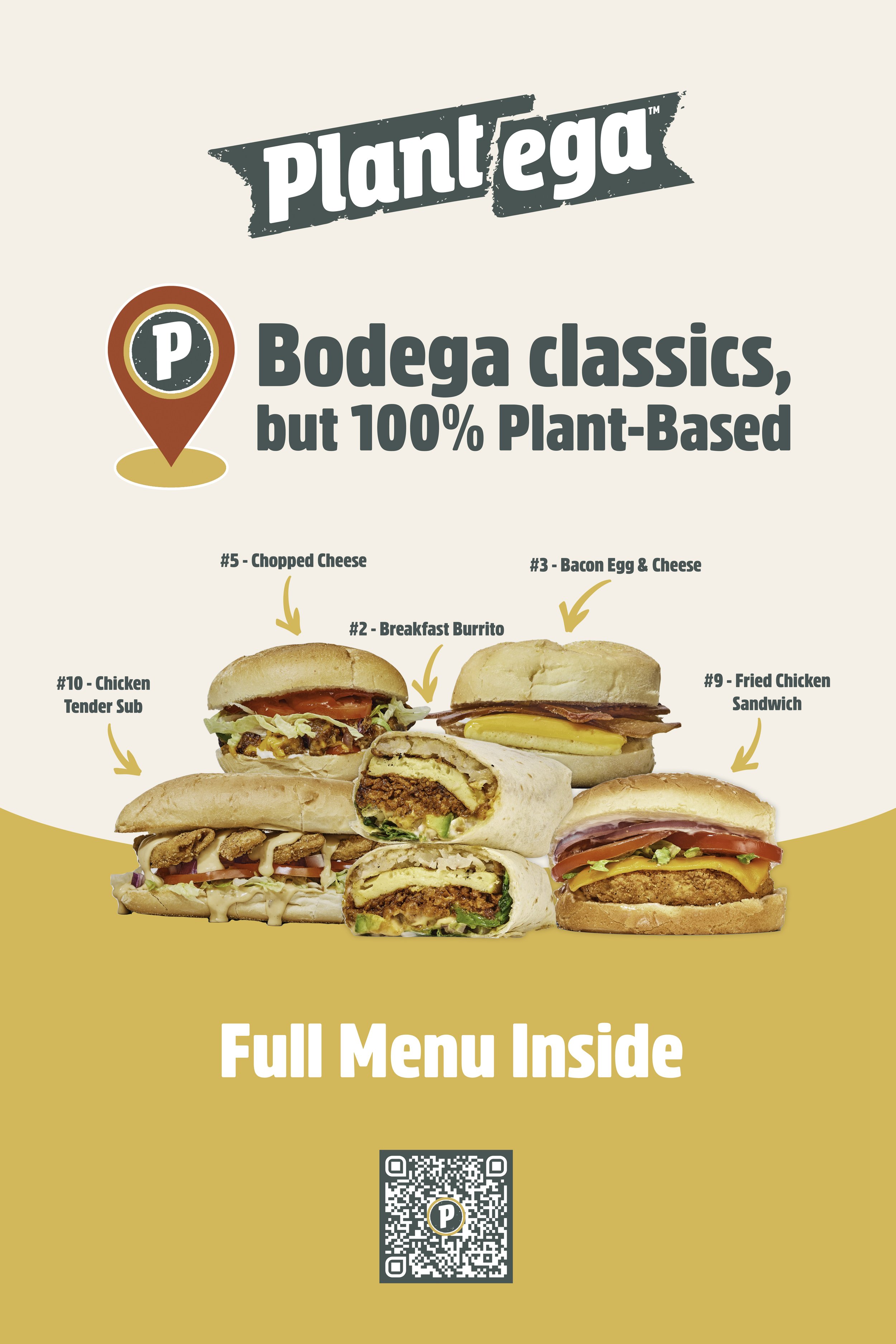
Menu & brand Revamp
The previous menu was a little too close to bodega style menus. It lacked refinement and a nod to the fact that these are premium products, that are new, good for the planet and good for you. I brought in more color and moved away from non appetizing colors like dull navy, white splotches etc. This menu presented a gambit of design challenges , as it will be printed for over 50 deli’s, be fit in various signs, in various locations and featured in many sizes. I developed several solutions for this as well as custom menus for stores with different items and prices.
We didn’t want to come into bodegas visually looking overly trendy. That would scream “we don’t belong here” and come off a bit too holier than thou. Plantega fits in and supports Bodegas while giving access to affordable vegan food to the cities people. So a vibrant yet not too overly colorful and bold menu was the right fit. We took more liberty with the delivery menus below to be bolder.

NEW BRANDING
We dropped the use of off-putting colors like reds and blues and focused in on the Plantega brand color green and used just one contrast color, yellow on a supporting off white background.
I updated brand standards and usage for signage, socials, print, merch and more.
We used elements like the colored blotches etc. across socials consistantly.


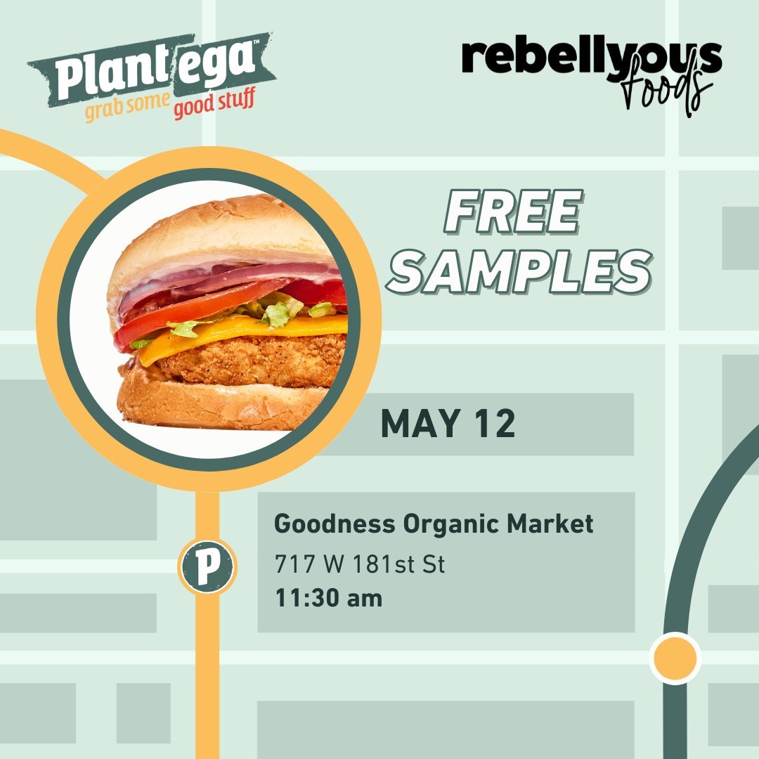
A-Frames and Posters
A lot of Plantega’s business are new customers who are interested in trying plant-based options.
For that reason, signage is crucial to their success. Plantega’s previous A-frames were confusing, lacked taxonomy and order, and had multiple exit points for people to stop caring and stop reading.
We worked on new posters that simplified down this process, to a very small amount of information that was easy to digest and understand -as well as enticing to check out. Utilizing hero images of menu items was key here - in a well designed and appealing way.
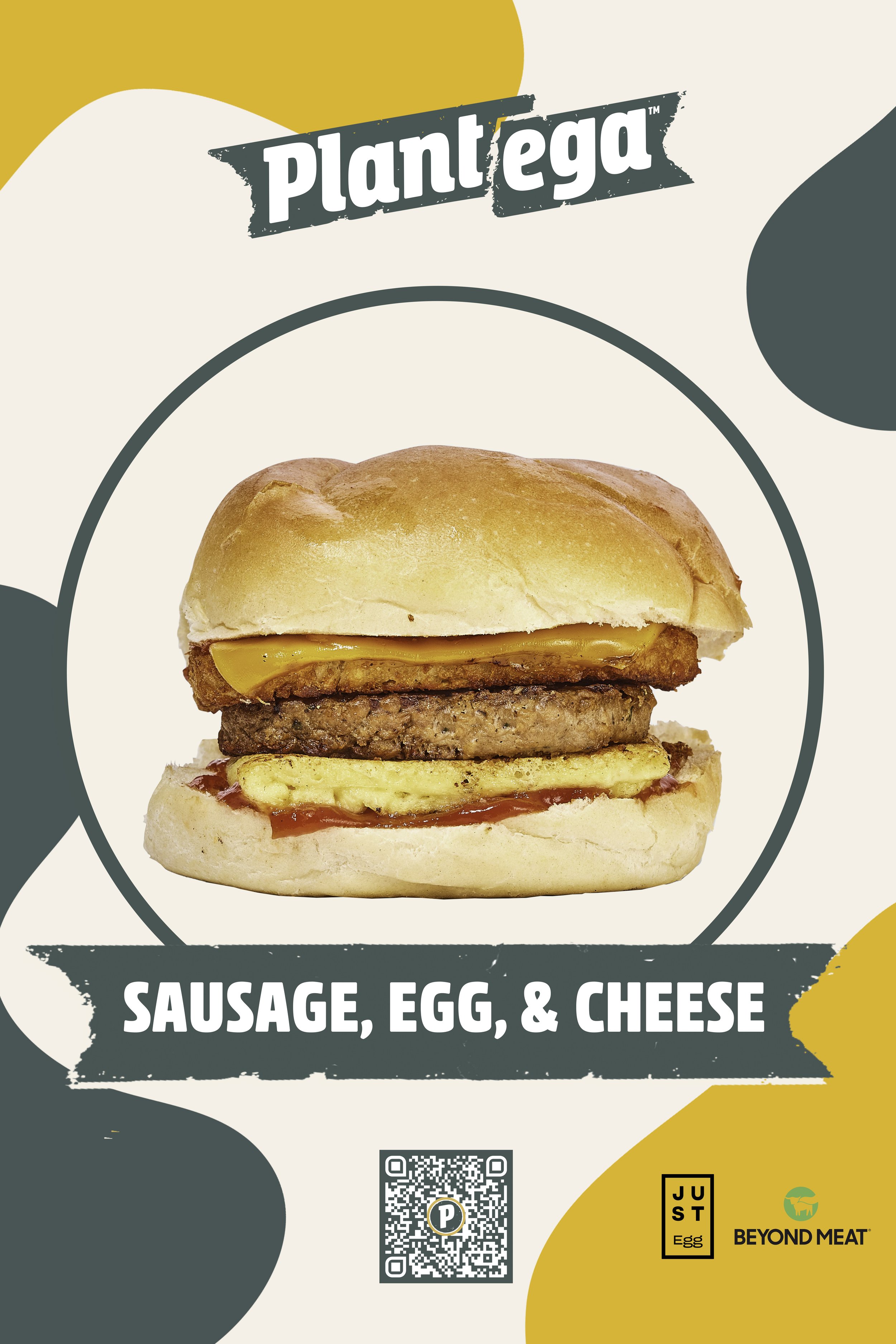

FULL DELIVERY MENU
Plantega also expanded into doing new delivery exclusive items through delivery partners.
There are a LOT of permutations of this menu and the regular menu for various delis that carry different product,
but here is the flagship version, it is a 4 flap fold out menu.

Outer Flap

INNER Flap
See More creative Direction Work: